New on Betfair Exchange: Market graphs now interactive and deep on detail
After 25 years Betfair Exchange graphs are changing. Look forward to more detail, precise timings and interactive elements, thanks to an innovative redesign...
-
Betfair Exchange graphs redesigned for new era
-
Find out not only how but when the odds moved
-
Interact to zoom in, pan out and add selections to graphs
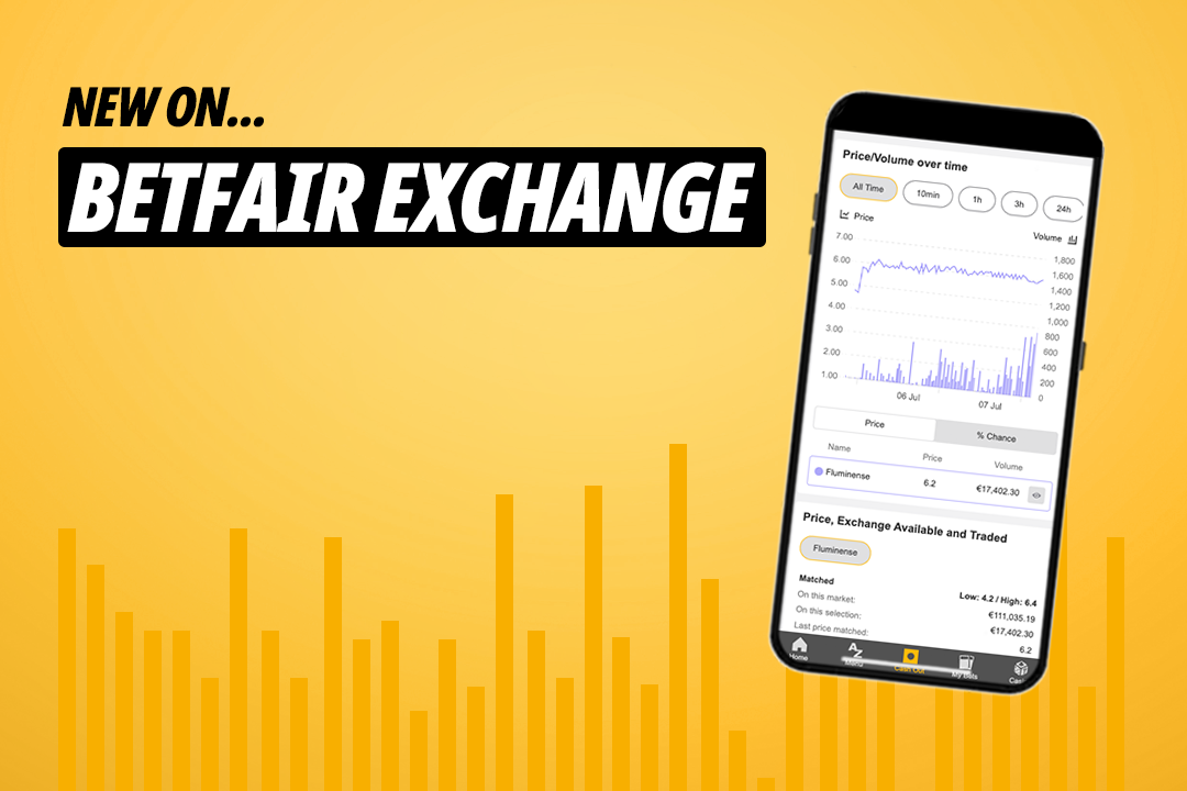
The Betfair Exchange is entering a new era with redesigned market graphs that will help punters track odds movements more closely than ever.
Since the Betfair Exchange revolutionised online betting in 2000, the graphs have been a way for punters to see how the odds moved in markets. Whatever the betting market, the graphs give an accurate picture of where punters were putting their money and the highs and lows of the various bets.
For 25 years, the graphs have told fascinating stories, showing the odds moves and amounts traded in markets across the site - American presidential elections, Cheltenham Gold Cups, World Cup finals and more.
Whether it's a heavy odds-on favourite overturned or a massive outsider shocking the market , the graphs capture all the drama of the Betfair Exchange.
Now in their new form, they will be just as accessible but far more detailed.
See how much was traded and when with new Betfair Exchange graphs
With the new Betfair Exchange graphs, you will see everything you saw before - the biggest and shortest prices, amounts traded by punters and how the odds moved - but now you will also be able to see when the odds shifted thanks to new time base filters.
The new graphs will be more interactive and tailored to your individual needs.
You can currently view one selections in each graph and there will also be an in-play marker to show when the market went in-play, how it moved in that period and sums traded.
You will able to zoom in and out, and scroll horizontally, to get close up to the data and alternately get the distance to focus on the bigger story.
The new Betfair Exchange graphs are designed to arm bettors with more information than ever before, so that you can see how and when a market moved and learn from the information.
After 25 years, the Betfair Exchange is entering a new era and it is going to be better than ever.
Read the latest Betting.Betfair articles and get our experts' best bets
Prices quoted in copy are correct at time of publication but liable to change.